How you name a problem determines the solution space.
"Error handling" → logs, strings, retry buttons. "Trust repair" → copy, direction, safety. The reframe preceded everything
Users don't want to know how it works. Safe or not?
Technical explanations were skipped. "No money was deducted" outperformed paragraphs. Emotional safety first.
AARRR is only useful if you identify the right stage.
Calling this a Revenue problem misses it. Mapping it to Activation changed the investment case entirely.
A tight constraint produced a sharper idea.
Design only the recovery moment. That forced depth over breadth. Good scope is a creative decision.
ON SCOPE
ON FRAMING
ON USERS
ON STRATEGY
13 | WHAT I LEARNT
Not just about payments. About designing for trust.
Ready to buy.
Price accepted. Delivery fine
THINKING
FEELING
DOING
EMOTION
Confident.
Intent is clear
Reviews cart. Taps checkout.
High intent
UPI is fastest.
Always use this.
Routine.
Done this before.
Selects UPI. Enters PIN.
Peak confidence
Did my money leave? What happened? Should I try again?
Anxious. Confused.
Deduction fear is dominant.
Reads error. Checks bank app. Considers leaving.
Anxiety spike
Network issue. Not my fault. Card makes sense.
Reassured. Directed.
Product is still with me.
Reads recovery card. Taps Card.
Trust recovered
The Gap.
Product goes silent. This is the entire brief.
Recovery layer.
Explain. Direct. Restore.
01 | CART
02 | PAYMENT
03 | FAILURE
04 | RECOVERY
05 | JOURNEY MAP
What the user thinks, feels, and does at each step
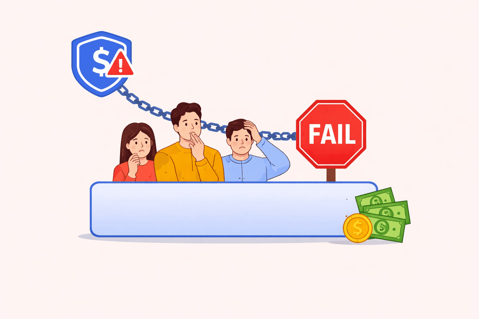
Digital payments are a daily part of life, until they fail.
While success is seamless, failure isn’t just a technical event. It breaks trust, creates uncertainty, and leaves users guessing what to do next.
This project explores how payment systems can guide users through failure with clarity, reassurance, and adaptive suggestions reducing abandonment and restoring confidence.
Timeline
1 Week
My Team
Individual Project
My Role
UX Design
Interaction Prototyping
JavaScript Simulation
Visual Storytelling
Tools
Figma
FigJam
Miro
Visual Code
Designing for when Payments Fail
Reframing payment failure as a moment of trust repair
HYPOTHESIS I'M EXPLORING
When a payment fails, is the real problem the transaction or the uncertainty that follows?
01 | CONTEXT
What is this and where does this live?
The 30 seconds after a payment fails.
The most consequential, least designed moment in mobile commerce.
UPI: Bank-to-bank. NPCI. No card.
Card: Separate auth network. 3D Secure.
Wallet: Prepaid. Depletes silently.
Net banking: Bank portal. Session.
India processes 10B+ UPI transactions/month. Peak-hour failures exceed 20%. This is not an edge case. It's a primary case to design for.
→
→
→
→
Abandons
User decides alone.
"Payment Failed. Try Again."
Event Logged
Rail Fails
THE RAILS
WHY IT MATTERS
02 | PROBLEM
Success is designed. Failure is not.
Teams optimise for the happy path. Failure is an exception
In a multi-rail checkout in India that assumption is wrong.
"Payment Failed.
Try Again."
Technically accurate. Experientially, a dead end. No cause. No deduction status. No direction.
Silence. The product says nothing when it should speak.
Naked Recommendation. Alternatives without context read as commercial not helpful.
THE ASSUMPTION
THE CURRENT RESPONSE
THE TWO GAPS
Cart → Checkout
Tapped Pay
Rail Failed
Abandon after generic error
With recovery layer confirmed payments
The design problem
THE FAILURES ARE TECHNICAL. THE ABANDONMENT IS COMMUNICATIVE. ONLY ONE REQUIRES A DESIGN SOLUTION.
06 | FINDING THE LEAK
Where the funnel actually breaks
07 | THE CONCEPT
Four steps. In this order. Always.
01
Address the money first.
"No money was deducted." Before anything else. Dissolves the fear that causes abandonment.
02
Explain in plain English.
"Your UPI session timed out." Not the error code. Past tense - closed, not ongoing.
04
One CTA. No ambiguity.
Failed rail dims, not disappears. Dimming respects autonomy. Same infrastructure. Different 30 seconds.
03
Recommend with a reason.
"Card runs on a separate network." Context converts scepticism into action.
UPI failure rates of 30–55% are structurally normal in India. Network congestion, bank server downtime, VPA resolution failures, and UPI PIN timeouts are daily realities not edge cases. NPCI's own data shows peak-hour failures above 20% systemically.
Cards fail differently. 3DS authentication timeouts, insufficient balance false-positives, and international card routing errors account for most failures. These are resolvable but only if the UI tells the user what happened.
Wallets deplete silently. A failed wallet payment with no balance explanation causes confusion Explaining "Wallet balance: ₹0 remaining" unlocks a redirect to UPI.
The failure is technical. The abandonment is communicative. Users leave because e nothing told them what to do next.
Why do Indian payment rails fail at such high rates?
THE NEW MODEL
What does "trust architecture" mean in this context?
Trust architecture treats the failure moment as a designed experience, not a logged exception. It asks: what does the user need to know right now? What does the system know that the user doesn't? How do we translate technical failure into human direction?
The Recovery Layer is the implementation of this shift. It intercepts failure events and runs them through three layers: interpretation (what kind of failure is this?), communication (what should the user know?), and direction (what should the user do next?).
08| UI SCREENS
Every screen. Every decision.


FAILURE WARNING
A simple warning showing what happened when the transaction has failed.
RECOVERY INLINE ALERT
The users feel relief when they see a warning which gives them information rather than being left in the dark
RECOMMENDATION
Give an alternate method of transaction because the original mode of UPI Failed
01 - BASELINE
02 - PROCESSING
03 - FAILURE
04 - RECOVERY
09 | THE CODE
How the recovery layer is actually implemented
FILE 1/3
The failure classifier - how does the system know what went wrong?
This is the brain. It maps rail + error code to a human-readable explanation. In production, the error code comes from your payment gateway response. In the prototype, failure is simulated with probability weights.
FILE 2/3
The UI renderer - how does the recovery state get painted to screen?
This function takes the classified failure object and updates the DOM. It shows the recovery card, dims the failed rail, and promotes the next best option to the top with a "Recommended" tag. No page reload required.
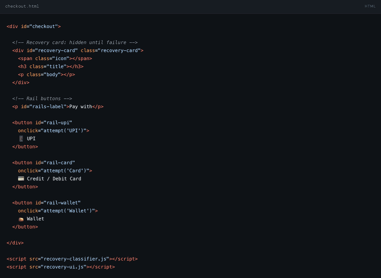
FILE 3/3
The HTML structure - what does the checkout markup look like?
This is the minimal HTML shell. The recovery card starts hidden. JS adds the visible class on failure. All rail buttons share the same ID pattern for the renderer to target them.
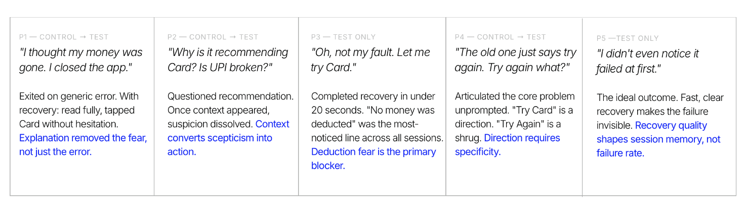
Exited on generic error. With recovery: read fully, tapped Card without hesitation. Explanation removed the fear, not just the error.
"I thought my money was gone. I closed the app."
Questioned recommendation. Once context appeared, suspicion dissolved. Context converts scepticism into action.
"Why is it recommending Card? Is UPI broken?"
Completed recovery in under 20 seconds. "No money was deducted" was the most-noticed line across all sessions. Deduction fear is the primary blocker.
"Oh, not my fault. Let me try Card."
Articulated the core problem unprompted. "Try Card" is a direction. "Try Again" is a shrug. Direction requires specificity.
"The old one just says try again. Try again what?"
The ideal outcome. Fast, clear recovery makes the failure invisible. Recovery quality shapes session memory, not failure rate.
"I didn't even notice it failed at first."
P1 — CONTROL → TEST
P2 — CONTROL → TEST
P3 — TEST ONLY
P4 — CONTROL → TEST
P5 —TEST ONLY
11 | USABILITY TESTING
5 participants.
Think-aloud. No lab.
Fear of deduction is the primary blocker, not the failure itself.

Why Harbour Molds Lines by Masterworks yet Sessions

Why Group Streamlining Onboarding and Saved With the Brightway

How Market.org Raisedup these RATE as 2x from Pathguide.
⸺ KEY FINDINGS
Razorpay or Cashfree sandbox API. Real error codes instead of simulated ones. One integration away from production-grade.
Connect to a real gateway sandbox.
Soon
Hypothesis: users who see the recovery layer have a higher 7-day return rate. That connects this directly to Retention with statistical confidence.
A/B test with 50+ users.
Later
12 | NEXT STEPS
Two moves. In this order.
Retry rate after failure
Context + direction produces willingness. Generic errors produce exits.
Post-failure abandonment
Guided recovery recaptures the majority before it becomes a lost conversion.
Early retention signal
Handled failure → trust deposit → return rate increase. The failure becomes a positive brand memory.
28%
−34%
↑Trust
10 | IMPACT
Recovery is a revenue lever
User arrives at checkout, intent present
Payment confirmed = first core value
Handled failure = trust deposit
Repeat purchase compounds from activation wins
"Their checkout worked when mine failed."
ACQUISITION
ACTIVATION
RETENTION
REVENUE
REFERRAL
SECONDARY
PRIMARY
ACTIVATION + RETENTION ARE WHERE PAYMENT RECOVERY CREATES VALUE. EVERYTHING ELSE COMPOUNDS FROM HERE.
03 | STRATEGY
Where this sits in the growth funnel

Glad we could cross paths!
I hope it left you with a bit of curiosity and inspiration.
LET'S CONNECT!
+91 96000 95584
→
→
→
→
Payment Confirmed
Processing
Tap Pay
Select Rail
Cart
→
→
→
Abandons
"Payment Failed. Try Again."
Processing
→
→
Alternative Rail Elevated.
Classified, Explained.
Processing
Confident Retry
SAME RAILS. SAME INFRASTRUCTURE. DIFFERENT 30 SECONDS
WITHOUT RECOVERY
WITH ADAPTIVE RECOVERY
No money deducted
Best rail surfaced
Payment confirmed
→
→
The right framework doesn't just measure the problem. It changes how seriously the team takes it.
Why Activation, not Revenue?
A failed payment is a failed activation the user never received core value. Teams that frame this as Revenue see a lost sale.
Teams that frame it as Activation see a failed first experiment. That reframe justifies design investment that pure revenue metrics never would.
Designing for when Payments Fail
Reframing payment failure as a moment of trust repair
Timeline
1 Week
My Role
UX Design
Interaction Prototyping
JavaScript Simulation
Visual Storytelling
My Team
Individual Project
Tools
Figma
FigJam
Miro
Visual Code
Digital payments are a daily part of life, until they fail.
While success is seamless, failure isn’t just a technical event. It breaks trust, creates uncertainty, and leaves users guessing what to do next.
This project explores how payment systems can guide users through failure with clarity, reassurance, and adaptive suggestions reducing abandonment and restoring confidence.
HYPOTHESIS I'M EXPLORING
When a payment fails, is the real problem the transaction or the uncertainty that follows?
India processes 10B+ UPI transactions/month. Peak-hour failures exceed 20%. This is not an edge case. It's a primary case to design for.
Rail Fails
↓
Event Logged
↓
"Payment Failed. Try Again."
↓
User decides alone.
↓
Abandons
02 | PROBLEM
Success is designed.
Failure is not.
THE ASSUMPTION
Teams optimise for the happy path. Failure is an exception
In a multi-rail checkout in India that assumption is wrong.
THE CURRENT RESPONSE
"Payment Failed.
Try Again."
Technically accurate. Experientially, a dead end. No cause. No deduction status. No direction.
THE TWO GAPS
Silence. The product says nothing when it should speak.
Naked Recommendation. Alternatives without context read as commercial not helpful.
01 | CONTEXT
What is this and where does this live?
The 30 seconds after a payment fails.
The most consequential, least designed moment in mobile commerce.
UPI: Bank-to-bank. NPCI. No card.
Card: Separate auth network. 3D Secure.
Wallet: Prepaid. Depletes silently.
Net banking: Bank portal. Session.
THE RAILS
WHY IT MATTERS
The right framework doesn't just measure the problem. It changes how seriously the team takes it.
Cart
↓
Select Rail
↓
Tap Pay
↓
Processing
↓
Payment Confirmed
04 | USER FLOW
The full path - including failure
Processing
↓
"Payment Failed. Try Again."
↓
Abandons
Processing
↓
Classified, Explained.
↓
Alternative Rail Elevated.
↓
Confident Retry
WITHOUT RECOVERY
↓
↓
05 | JOURNEY MAP
What the user thinks,
feels, and does at each step

Cart → Checkout
Tapped Pay
Rail Failed
Abandon after generic error
With recovery layer confirmed payments
The design problem
03
Recommend with a reason.
"Card runs on a separate network." Context converts scepticism into action.
04
One CTA. No ambiguity.
Failed rail dims, not disappears. Dimming respects autonomy. Same infrastructure. Different 30 seconds.
Why do Indian payment rails fail at such high rates?
UPI failure rates of 30–55% are structurally normal in India. Network congestion, bank server downtime, VPA resolution failures, and UPI PIN timeouts are daily realities not edge cases. NPCI's own data shows peak-hour failures above 20% systemically.
Cards fail differently. 3DS authentication timeouts, insufficient balance false-positives, and international card routing errors account for most failures. These are resolvable but only if the UI tells the user what happened.
Wallets deplete silently. Users don't track wallet balances. A failed wallet payment with no balance explanation causes confusion, not a retry. Explaining "Wallet balance: ₹0 remaining" immediately unlocks a redirect to UPI.
The failure is technical. The abandonment is communicative. Users don't leave because payment failed. They leave because nothing told them what to do next.
FILE 3/3
The HTML structure - what does the checkout markup look like?
This is the minimal HTML shell. The recovery card starts hidden. JS adds the visible class on failure. All rail buttons share the same ID pattern for the renderer to target them.
Retry rate after failure
Context + direction produces willingness. Generic errors produce exits.
28%
Post-failure abandonment
Guided recovery recaptures the majority before it becomes a lost conversion.
−34%
Early retention signal
Handled failure → trust deposit → return rate increase. The failure becomes a positive brand memory.
↑Trust
A/B test with 50+ users.
Later
How you name a problem determines the solution space.
"Error handling" → logs, strings, retry buttons. "Trust repair" → copy, direction, safety. The reframe preceded everything
Users don't want to know how it works. Safe or not?
Technical explanations were skipped. "No money was deducted" outperformed paragraphs. Emotional safety first.
AARRR is only useful if you identify the right stage.
Calling this a Revenue problem misses it. Mapping it to Activation changed the investment case entirely.
A tight constraint produced a sharper idea.
Design only the recovery moment. That forced depth over breadth. Good scope is a creative decision.
03 | STRATEGY
Where this sits in the growth funnel
User arrives at checkout, intent present
Payment confirmed = first core value
Handled failure = trust deposit
Repeat purchase compounds from activation wins
"Their checkout worked when mine failed."
ACQUISITION
ACTIVATION
RETENTION
REVENUE
REFERRAL
SECONDARY
PRIMARY
WITH ADAPTIVE RECOVERY
SAME RAILS. SAME INFRASTRUCTURE. DIFFERENT 30 SECONDS
06 | FINDING THE LEAK
Where the funnel actually breaks
07 | THE CONCEPT
Four steps. In this order. Always.
01
Address the money first.
"No money was deducted." Before anything else. Dissolves the fear that causes abandonment.
02
Explain in plain English.
"Your UPI session timed out." Not the error code. Past tense - closed, not ongoing.
THE NEW MODEL
What does "trust architecture" mean in this context?
Trust architecture treats the failure moment as a designed experience, not a logged exception. It asks: what does the user need to know right now? What does the system know that the user doesn't? How do we translate technical failure into human direction?
The Recovery Layer is the implementation of this shift. It intercepts failure events and runs them through three layers: interpretation (what kind of failure is this?), communication (what should the user know?), and direction (what should the user do next?).
08| UI SCREENS
Every screen.
Every decision.
09 | THE CODE
How the recovery layer is actually implemented
Three files. No framework required. Pure HTML, CSS, JavaScript. You can drop this into any existing checkout page. Here's what each piece does and why.
FILE 1/3
The failure classifier - how does the system know what went wrong?
This is the brain. It maps rail + error code to a human-readable explanation. In production, the error code comes from your payment gateway response. In the prototype, failure is simulated with probability weights.
FILE 2/3
The UI renderer - how does the recovery state get painted to screen?
This function takes the classified failure object and updates the DOM. It shows the recovery card, dims the failed rail, and promotes the next best option to the top with a "Recommended" tag. No page reload required.
10 | RECOVERY
Recovery is a revenue lever
11 | USABILITY TESTING
5 participants.
Think-aloud. No lab.
Phone in hand. Task given. Nothing explained. Half saw generic error first, then recovery. Half saw only recovery.
Fear of deduction is the primary blocker, not the failure itself.
Why Harbour Molds Lines by Masterworks yet Sessions
Why Group Streamlining Onboarding and Saved With the Brightway
How Market.org Raisedup these RATE as 2x from Pathguide.
Razorpay or Cashfree sandbox API. Real error codes instead of simulated ones. One integration away from production-grade.
Connect to a real gateway sandbox.
Soon
Hypothesis: users who see the recovery layer have a higher 7-day return rate. That connects this directly to Retention with statistical confidence.
13 | WHAT I LEARNT
Not just about payments.
About designing for trust.
12 | NEXT STEPS
Three moves.
In this order.
A simple warning showing what happened when the transaction has failed.
Give an alternate method of transaction because the original mode of UPI Failed
The users feel relief when they see a warning which gives them information rather than being left in the dark
ACTIVATION + RETENTION ARE WHERE PAYMENT RECOVERY CREATES VALUE. EVERYTHING ELSE COMPOUNDS FROM HERE.
A failed payment is a failed activation the user never received core value. Teams that frame this as Revenue see a lost sale.
Teams that frame it as Activation see a failed first experiment. That reframe justifies design investment that pure revenue metrics never would.
THE FAILURES ARE TECHNICAL. THE ABANDONMENT IS COMMUNICATIVE. ONLY ONE REQUIRES A DESIGN SOLUTION.
01 - BASELINE
02 - PROCESSING
03 - FAILURE
04 - RECOVERY
⸺ KEY FINDINGS
ON FRAMING
ON USERS
ON STRATEGY
ON SCOPE
Why Activation, not Revenue?
Glad we could cross paths!
I hope it left you with a bit of curiosity and inspiration.
LET'S CONNECT!
+91 96000 95584
FAILURE WARNING
RECOVERY INLINE ALERT
RECOMMENDATION
04 | USER FLOW
The full path - including failure