In order to create anything high- fidelity, we needed to start at the roots and work our way up. Therefore the first step was to tackle the website's current structure.
Web & Navigation Content
RESEARCH
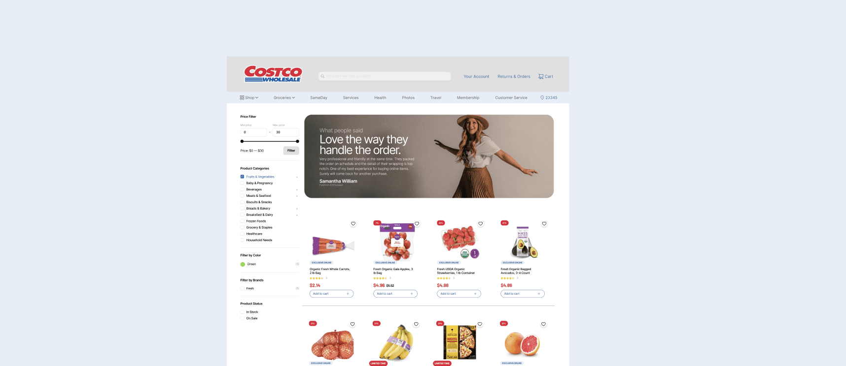
Costco's website was clearly unreflective of its current in-experience, but in order to truly understand the issues of the website, we took to interviewing current and prospective customers to understand the the outstanding issues.
Costco's
Current Site

CONTACT
+91 96000 95584
Costco: Redefining the Warehouse
Bulk value, zero friction.
Timeline
2 Weeks
My Team
Sanchita Thiagarajan
My Role
Digital Product
Designer
Tools
Figma
FigJam
Miro
Maze
I reimagined the Costco digital ecosystem to transform a high-volume warehouse into a streamlined, member-first experience. I balanced a massive inventory with a minimalist UI, reducing friction in the path to purchase while maintaining brand authority. This project sharpened my ability to scale complex information architectures into clean, zero-bottleneck user journeys.
Cluttered Product Architecture
Fragmented information architecture makes it difficult for users to compare delivery options, pricing, and core product benefits at a glance.
User Friction & Overload
Users struggle to find products easily due to clutter and long scrolling.
Lack of Mobile Optimization
Mobile experience is crowded and hard to navigate compared to desktop.
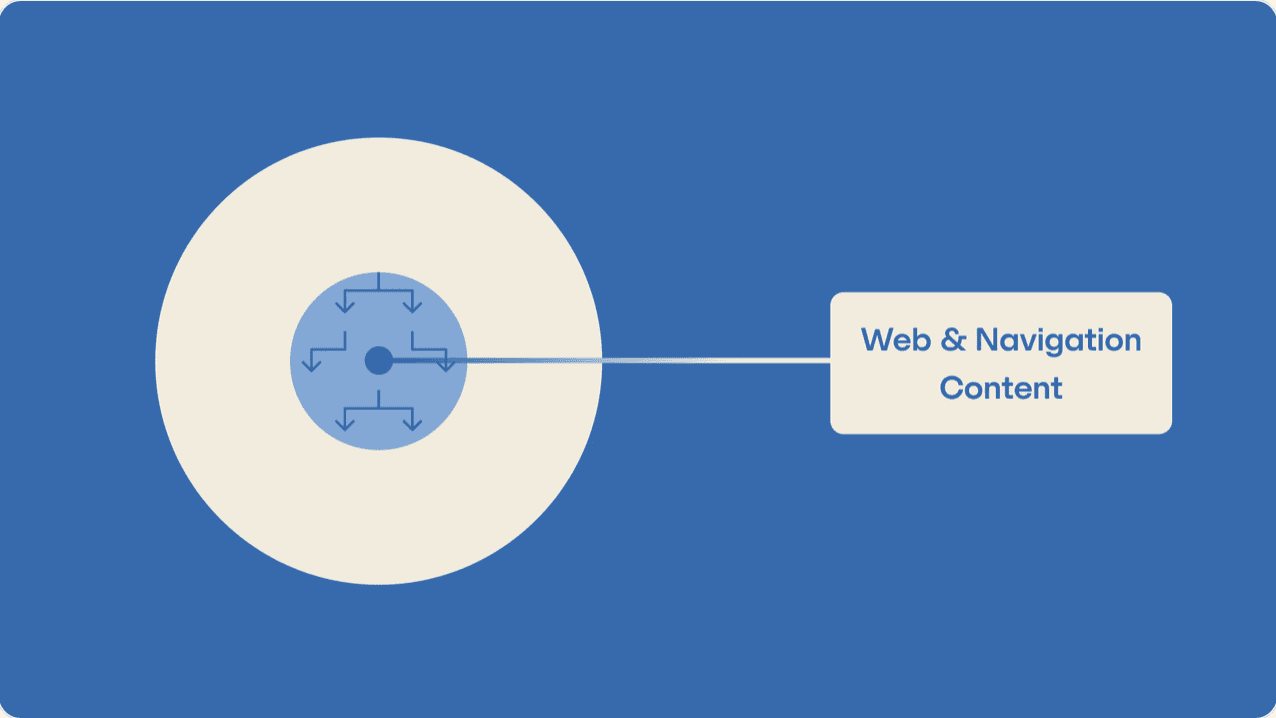
Before tackling the redesign of the whole redesign of Costco's web and mobile experience, I worked to create a framework of how I would tackle this academic project. We would be working from inside out.
Planning the
approach
01
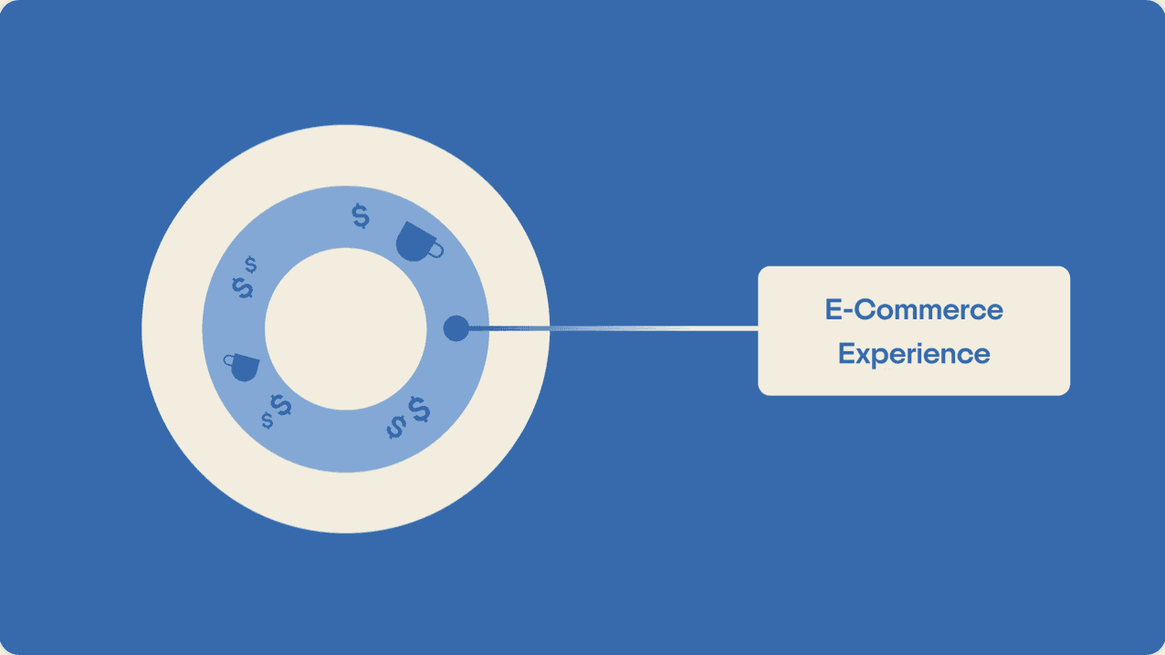
We then would separate the user experience within the online ordering section to better reflect any changes made from the past step.
E- Commerce Experience
02
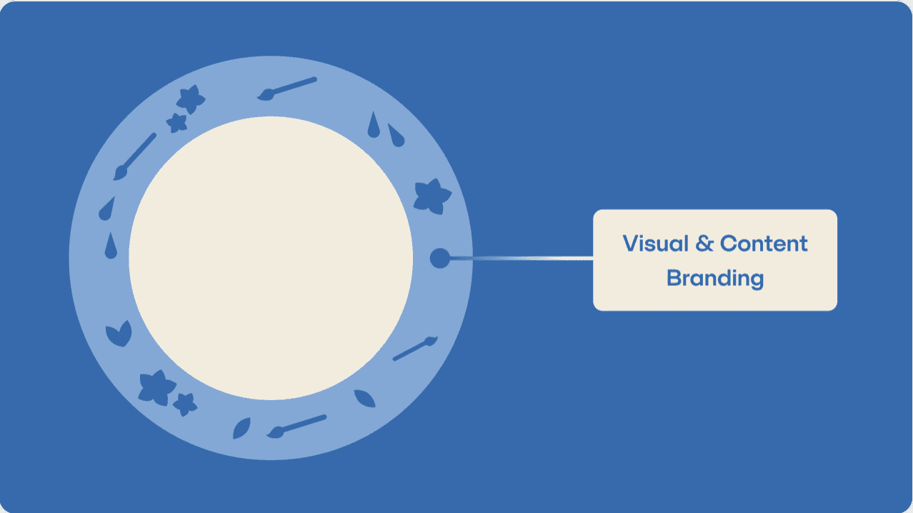
This step would focus on layering Costco's branding and visual aesthetic with our new structered architecture
Visual Branding
03